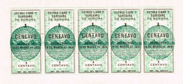
Printing varieties on the $1, $5 and $10 notes
(This section, and the following three sections, are the result of research by Robert Perigoe. This information originally appeared in the August 2011, December 2011 and March 2012 issues of the Journal of the U. S. Mexican Numismatic Association.)
Watermarks
Notes from Series One often exhibit part of the watermark 'STRATHMORE PARCHMENT 1911' on one line“Strathmore” was a brand name in use from the 1890s by the Mittineague Paper Company of West Springfield, Massachusetts. The firm was owned by Horace A. Moses, who later purchased the nearby Woronoco Paper Mills and merged the two entities into the Strathmore Paper Company in about 1911. The brand name and its symbol, the thistle, represented the owner’s personal regard for Scotland; Strathmore means “large valley” in Gaelic. In 1914 Moses opened an impressive new mill with a large, state-of-the-art paper machine, and this likely is the facility shown in this film.
Throughout its corporate existence, the Strathmore Company emphasized the firm’s commitment to fine papermaking. The processes involved sorting, washing, cutting, and beating rags into a watery pulp that flowed onto the moving wire screen of the huge paper machine. As the water drained away, the pulp formed a continuous web that could be passed through several pairs of rollers. These extracted more water and finally wound the damp paper onto large heated drying rolls. Employees then turned to the finishing operations of sizing, cutting, pressing or “calendering,” as it is known in the paper trade, and final inspection of the sheets.
The featured paper, “Strathmore Parchment,” was used for high-grade letterhead and business stationery. Strathmore worked in association with Rag Content Paper Manufacturers, which promoted the use of quality papers, those made from rags. Much of the paper produced at the time was made from wood pulp, which resulted in cheaper but much less durable paper. Pulp papers became brittle and were prone to rapid yellowing or fading. Rag papers were stronger, noted for durability and for “impressiveness,” according to the marketing materials produced by their manufacturers (Helena E. Wright, Curator of Division of Culture and the Arts, National Museum of American History, Smithsonian Institution)., whilst notes from the remaining three series may exhibit part of the watermark 'A. Z. & S. / LINEN LEDGER' on two lines.
Mountain Seals
The seals used on the Estado de Sonora provisional issue were also used on the contemporaneous issues of typeset provisional revenue stampssee Sinaloa SN11 to SN20 and Sonora S11 to S30 in Richard B. Stevens, The revenue stamps of Mexico, Mexico-Elmhurst Philatelic Society International, 1979. These stamps utilised the exact same five comparatively intricate mountain seals used as security devices on the peso currency values (and the 10 centavos issue), as well as the same less intricate five hand seals used as security devices on the other centavos issues.
When Luis Sotomayor handed over responsibility for the Tesorería General to Jesús Ramos in December 1914 he handed over five facsímiles with the name ‘C. E. Randall’, a rubber stamp of 'C. E. Randall’, five seals (resellos) of scale and Liberty Cap (balanza y Gorro de la Libertad), five of mountain and Liberty Cap, five of torch and Liberty Cap, and five of anvil (yunque) and Liberty CapAGHES, Fondo Oficialidad Mayor, tomo 2991, handover report, 15 – 22 December 1914.
Each mountain seal consists of a view of four mountain peaks overlooking a body of water with ripples on its surface. Above the mountains is the Liberty Cap with three colorless marks on it and 18 major rays extending outwards from it. The dark areas of the water and sky have tightly spaced diagonal shading, whereas the dark areas of the mountains are solid. The diagonal shading is not always discernible on the currency due to over-inking, but the shaded areas still tend to appear lighter than the solid areas. In general, the revenue stamps bear much clearer impressions of the seals, and are a useful reference as shown in the illustration below. This example is the earliest issue using the seals and they appear in consecutive order, 1 through 5, reading from left to right. In subsequent issues the seals were transposed in several different positions.
The distinguishing features of the five types of genuine Mountain Seals follow. The illustrations are all from the one peso notes.
| Type 1 | 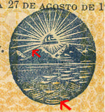 |
Thick ray leading from the bottom of the Liberty Cap and pointing to the leftmost mountain |
| Type 2 | 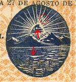 |
Spots in the two large rays to the right of the vertical ray at the centre Long ripple one third of the way down and centre-left in the water The middle mark on the Liberty Cap is circular and joined to the dash-shaped mark at the right. |
| Type 3 | 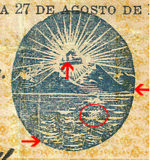 |
An enclosed colourless circle in the water near the outer edge at 7 o’clock Diagonal scratches in the water, one third of the way down and central right Diagonal lines on the lower right of the rightmost mountain On the Liberty Cap, the left and middle marks are almost rectangular and at the same level. |
| Type 4 | 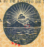 |
A circular notch in the water at the outer edge at 7 o’clock Two other colourless spots in line with this notch to the right and downward At least one colourless spot in the horizontal lines above the shoreline. |
| Type 5 | 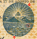 |
A circular notch in the outer edge, or an enclosed colourless circle by the outer edge, of the water between 6 and 7 o’clock A vertical scratch from 1:30 towards 5:00 (The dark spot circled in the illustration is not part of the seal, but a stray spot from the black printing.) |
While it is challenging to distinguish between the five genuine seals, it is relatively easy to distinguish the seals found on counterfeits from any of the genuine seals.
Eagle Seals
The eagle seals are very easy to distinguish, and are in themselves sufficient to identify the printing positions.
| Large – Normal 'C' | 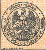 |
Large size seal (38.5 mm) with no break in the top of the ‘C’ in ‘MEXICANA’ |
| Large - Broken 'C' | 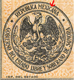 |
Large size seal (38.5 mm) with a break in the top of the ‘C’ in ‘MEXICANA’ |
| Small – With Spot | 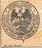 |
Small size seal (35.5 mm) with a colorless spot in the inner border between ‘LIBRE’ and ‘Y’ (This seal also has a broken ‘C’ in ‘MEXICANA’, as does a fourth type not used in the peso notes and so not shown here, Small- No Spot) |
Numbering Devices
Four different numbering devices were used in the peso denominated notes, and while it is simple to distinguish between Fancy and Block, it is quite another to distinguish between the sub-categories, Thick and Thin (Perigoe is not sure how useful the exercise is, but since passing references to distinctions have been made in the literature, he identifies all four, recognizing that other than the obvious differences, the minor differences may not be recognizable… distinctions without a difference). With some three of the four being used on each sheet, there is bound to be a Thick and Thin example of either the Fancy or Block type.
The term 'Fancy' refers to the ornate style of the 'N' in 'No.', namely an italic style with curved ends and ball serifs on both uprights. On the other hand, 'Block' refers to a standard 'N' with straight serifs.
| Thick Fancy | 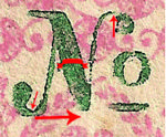 |
Diagonal of the 'N' is thick, although it can actually appear thin because of a colourless portion due to under-inking. The diagonal and right upright of the 'N' meet at a level considerably higher than the base of the ball serif. Both ball serifs are relatively close to the uprights. |
| Thin Fancy | 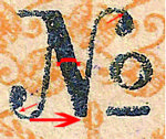 |
Diagonal of the 'N' is thin. The diagonal and right upright of the 'N' meet at almost the same level as the base of the ball serif. Both ball serifs are farther from the uprights. |
| Thick Block | 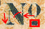 |
Diagonal of the 'N' is thick and meets the right upright about hallway from the bottom. |
| Thin Block | 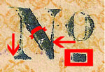 |
Diagonal of the 'N' is thin and meets the upright about one third of the way from the bottom. |
Printing Positions
 The three higher values were printed three to a sheet. With the exception of a few pesky aberrations, there are three distinct types of notes in each value and each series. It can be shown that each type was consistently found in the same position on a sheet of three (through watermarks or signature carry-overs on adjacent notes from the same sheet).
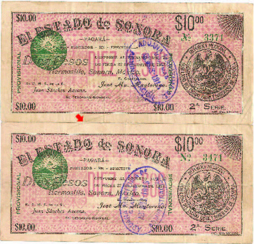
This illustration shows a partial reconstruction of a sheet (the top two positions). Note that the Randall signature carries over from the top note to the one below it indicating that the notes were signed prior to separating them. Equally significant is the fact that no signature carry-over is found on the top position, but one would have extended below the second position.
The paper used was simple letter sized bond. The three positions are numbered 1 through 3 starting at the top and reading downward to the bottom. Once the positions were nailed down, the anomalies were readily identified and a theory could be put forward to account for them.
Numbering Patterns
Typically, each sheet would contain a note in each of the three positions, and would be printed in runs of 100 sheets. Position 1 (top of sheet) on the first sheet of the first run would be numbered 1, and the same position on the last sheet of the first run would be numbered 100. At the same time, position 2 (middle of sheet) on the first sheet of the first run would be numbered 101, and the same position on the last sheet of the first run would be numbered 200. Also, at the same time, position 3 (bottom of sheet) on the first sheet of the first run would be numbered 201, and the same position on the last sheet of the first run would be numbered 300.
On the first sheet of the second run, all numbers would have to be 300 higher than the corresponding position on the first run, so numbers were repeated or missed in the transition. Thus position 1 (top of sheet) on the first sheet of the second run would be numbered 301, and the same position on the last sheet of the second run would be numbered 400. At the same time, position 2 (middle of sheet) on the first sheet of the second run would be numbered 401, and the same position on the last sheet of the first run would be numbered 500. Also, at the same time, position 3 (bottom of sheet) on the first sheet of the second run would be numbered 501, and the same position on the last sheet of the first run would be numbered 600.
Thus:
0001 0002 0003 0004 0005 0006 ... 0098 0099 0100
0101 0102 0103 0104 0105 0106 ... 0198 0199 0200
0201 0202 0203 0204 0205 0206 ... 0298 0299 0300
0301 0302 0303 0304 0305 0306 ... 0398 0399 0400
0401 0402 0403 0404 0405 0406 ... 0498 0499 0500
0501 0502 0503 0504 0505 0506 ... 0598 0599 0600
Most of the anomalies that crept in and needed to be corrected occurred when a new run was begun with the last row of the prior run either repeated or omitted altogether. The result was an offset in the numbering pattern. It was an easy mistake to make, similar to the lack of understanding as to whether 2000 was the last year of the prior millennium or the first year of the next.
There are atypical instances of intentional runs of 500 and of 150 notes, and of less than three positions being used if it would have produced more notes than authorised.