Classification of Gobierno Provisional de México notes
Elmer Powell has classified all the various printings of Gobierno Provisional de México by two types of imprints (‘MEXICO OFICINA DEL GOBIERNO’ and ‘OFICINA DEL GOBIERNO’), by series, by four titles and by three underprints. Many colour varieties appear due to ink mixtures and the variety of papers available during the revolutionary period. There are some noticeable colour differences (for example, some $20 have a blue reverse and some a red reverse), but if they can be consigned to changes in title or underprint, they do not of themselves produce different types. Others have suggested that green underprint and brown underprint on an otherwise identical note are different types.
Imprints
Two styles are known.
 |
|
| Imprint A | Imprint B |
Titles
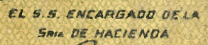
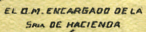
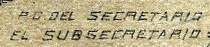
Four titles were used for the treasury official whose signature appears on the lower right front of each note. In English these translate either as ‘the Subsecretary (or Chief of Staff) in charge of the Department of Finance’ or ‘by order of the Secretary, the Subsecretary’.
 |
|
| Title A EL S.S. ENCARGADO DE LA SRIA. DE HACIENDA |
Title B EL O.M. ENCARGADO DE LA SRIA. DE HACIENDA |
|
|
|
| Title C P.O. DEL SECRETARIO EL SUBSECRETARIO |
Title D P.O. DEL SRIO. EL S.S. |

Underprints
Three general types are known for all denominations.


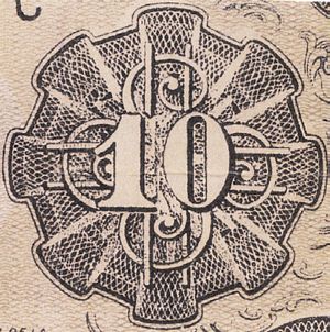
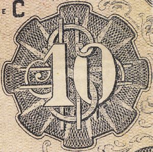
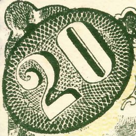
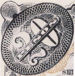
Within the different values another noticeable difference is the style used for the denomination in the corners (or, for the $10, in the guilloche).
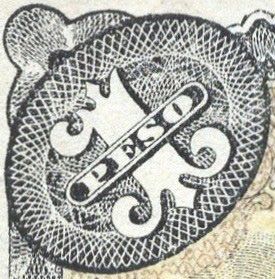
One Peso Note Styles
|
|
|
|
| curved base | flat base with rhombus in corners | flat base |
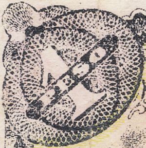
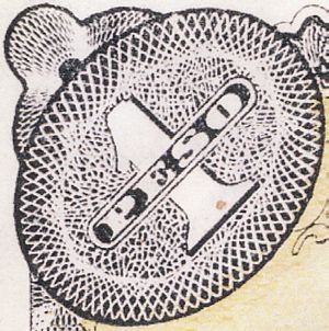
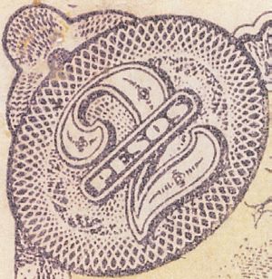
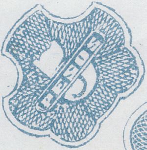
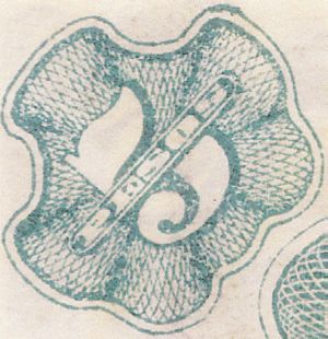
Two Pesos Note Styles
|
|
|
| curved base | flat base |
Five Pesos Note Styles
|
|
|
| small 5 | large 5 |
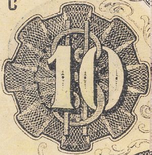
Ten Pesos Note Styles
|
|
|
|
| México | small Veracruz | large Veracruz |
Twenty Pesos Note Styles
|
|
|
|
| curved base | flat base | fancy base |
Elmer also distinguished between Roman ‘No,’ and italic ‘No.’ though we need to decide whether these were definite decisions about appearance or just the consequence (as in most cases of revolutionary paper money) of the shortage of type. Elmer decided to ignore most of the variations in background colour as attributable either to different print runs or aging, but also neglected another factor that might be important, especially with the Veracruz issues, namely, the nature of the Secretaría de Hacienda validating seals on the reverse. In the accompanying tables for the different denominations I have occasionally tried to distinguish between the various seals.